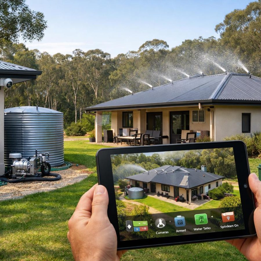
A bushfire protection system can be technically sophisticated without being hard to use. For ordinary homeowners, the best system is the one that gives clear answers in seconds, supports good decisions under stress and avoids menus, jargon and unnecessary choices when the pressure is on.
Why simplicity matters for ordinary people
In a bushfire, people do not have time to interpret pump logic, check hydraulic states or work through technical menus. They need to know three things straight away: whether the home is ready, whether attention is required, and what to do next. That is why Part 17 of the Integrated Residential Bushfire Protection System focuses on usability and resident interaction.
The idea is simple: the engineering can be complex, but the homeowner experience must stay clear, calm and hard to misuse. The resident should not have to understand how the system decides which zones to protect, how pumps are staged, or how sprinkler calculations are balanced. Those decisions belong to the controller and the qualified technicians who install and service it.
This part of the system contributes 2% of the overall readiness model. That weighting is about usability and resident interaction only. It does not represent a probability of house survival, and it should never be presented that way. Its role is to make sure the people living in the house can see what matters, act quickly and avoid confusion.
Use Green, Amber and Red as the main language
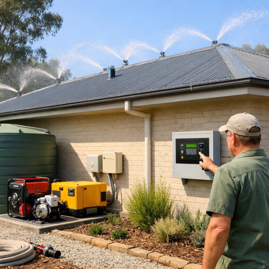
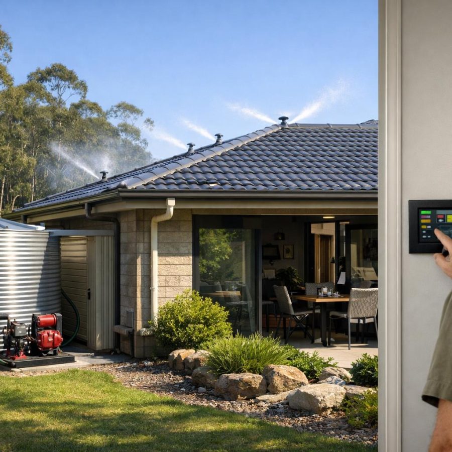
The main homeowner screen should use a simple colour status display with a short plain-English message beside each colour. This keeps the system readable at a glance, even for someone who is tired, anxious or unfamiliar with the equipment.
A sensible homeowner-facing structure is:
- GREEN — READY — System is normal and ready.
- AMBER — ATTENTION REQUIRED — Something needs checking or fixing.
- RED — PROTECTION REDUCED — The system is not fully available and safety is lower.
These words do more than show a condition. They tell the resident how serious the issue is and whether they need to act now or simply note a warning. The plain-English line must be short and direct. For example, the amber state might say, “Generator fuel low. Refill required.” That is easier to understand than a technical alarm name or subsystem code.
Technical fault codes can still be shown, but they should sit underneath the plain message and not dominate the screen. The ordinary user sees the meaning first. The technician sees the detail second. That order matters during stress.
A useful design rule is that every status screen should answer three questions quickly: what is happening, how serious is it, and what should I do now? If the screen cannot answer those three questions, it is probably too complicated for emergency use.
Make Fire Protection ON a single, obvious action
During a bushfire threat, the resident should not have to choose zones, compare options or decide which parts of the protection system to start. The interface should provide a single Fire Protection ON button that activates the core system without requiring the resident to select individual zones.
That does not mean the system becomes less capable. It means the complexity stays behind the scenes. The controller can still decide which pumps, sprinklers, shutters, valves or other protection measures are required. The homeowner simply tells the system to move into protection mode.
This approach has a few advantages. It reduces hesitation, it reduces the chance of selecting the wrong setting, and it makes training easier for family members who do not use the system every day. In a real emergency, people often need the same button they used in practice mode, with the same layout and the same wording.
The Fire Protection ON control should be large, clear and placed in a predictable position on the main screen. If voice announcements are available, they should support the button rather than replace it. A spoken prompt can be useful, but it must remain optional because some residents will prefer silence, and some situations will make audio difficult to hear.
There should also be a Fire Protection OFF / Reset control, but it must be safety controlled. It should not allow accidental shutdown during a confirmed fire threat. The system should confirm that conditions are safe enough before shutdown or reset is allowed. In other words, convenience must not override protection.
For ordinary use, this is the right balance: one clear way to start protection, one controlled way to stop or reset it, and no need for residents to become system operators in the middle of an emergency.
Keep the decision path short
- See the colour status.
- Read the short plain-English message.
- If needed, press Fire Protection ON.
- If the situation is safe, use the controlled OFF / Reset path.
That is enough for most homeowners. Anything more can be placed behind a separate advanced screen.
Use a simple “What do I need to do now?” screen
During Alert or Fire Mode, the system should display a dedicated screen titled What do I need to do now? This is one of the most important usability features because it gives residents a clear response path without forcing them to search through menus.
The screen should show a short action list first, followed by optional extra detail. The resident should be able to glance at the screen and know the next step. If they want more information, they can open the additional detail, but the first screen should always stay simple.
The instructions should change depending on whether residents are:
- Home
- Away
- Evacuating
For example, someone at home may be told to stay alert, prepare to leave, close up the home if safe to do so, gather essential items and follow official advice. Someone away from the property may be told to check the status remotely, contact a trusted person if required, and follow local emergency information. Someone evacuating may be told to leave immediately if directed, take the emergency kit, confirm family members are accounted for and not delay departure.
The wording should remain broad and practical. It should never pretend to replace official warnings, local emergency advice or evacuation directions. The purpose of the screen is to reduce confusion and improve response, not to turn the homeowner into an incident commander.
A simple layout helps:
- Current situation — Home, Away or Evacuating.
- Immediate action — One or two steps.
- Extra detail — Optional supporting information.
That structure helps people act quickly without overwhelming them. It also supports family members who may be younger, stressed, tired or unfamiliar with the system.
Give users an Emergency Help button that actually helps
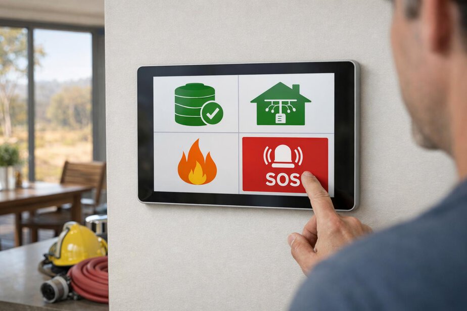
In a stressful situation, one of the most useful features is a clear Emergency Help button. It should be easy to find from the main screen and should show the information most likely to help the resident, a family member, a neighbour or a firefighter.
The Emergency Help screen should include:
- Property address
- Current system status
- Occupancy status
- Firefighter access information
- Emergency contact options
This information should be presented in a clean, readable format with large text and high contrast. The user should not need to open multiple menus to find the address or the current mode. If a house is in an unfamiliar area, a clear address display can save valuable time.
Firefighter access information should be practical and concise. It might include where the main access point is, where a key or access control is stored if one exists, and any important notes that would help authorised responders reach the right area without delay. It should not contain clutter or technical language that a resident does not need in a hurry.
The contact options should also be simple. The system should allow emergency contacts to be shown clearly, but those alerts should remain optional. Not every household wants the same people contacted in the same way, and residents should control who receives alerts.
If voice announcements are enabled, the Emergency Help screen may read out the most important information. But voice must stay optional, because a visual screen is still essential when power, noise or hearing conditions make audio less useful.
Used properly, the Emergency Help button becomes a practical bridge between residents and responders. It helps the people inside the house explain the situation clearly without needing to remember every detail under pressure.
Build guided setup that normal people can finish
A bushfire protection system should not assume that every resident is technically confident. After installation, there should be a short guided setup that helps the household enter the basic information the system needs to operate well.
The setup should cover:
- Household details
- Preferred alerts
- Emergency contacts
- Testing schedule
- Emergency information
This setup should feel like a guided walk-through rather than a complex configuration process. The aim is to help the resident get the essentials right without needing to understand engineering terms or system architecture. Where possible, each step should explain why the information is needed.
Household details should include a household profile covering children, older residents, mobility limitations, pets and any other important needs the residents choose to provide. The profile should be optional where appropriate, because some households will not want to record every detail. Still, if the information is entered, it can improve the usefulness of emergency prompts and help tailor the response messages.
Preferred alerts should be easy to set. Some people will want text messages, some will prefer app alerts, and some will want both. Trusted-contact alerts must remain optional. Residents should decide who receives what information and when. The system should support that choice without making it awkward.
The testing schedule should also be simple. Residents need to know when the system should be checked, what the test mode does, and whether a technician visit is due. A clear schedule helps avoid the common problem of leaving testing until it becomes urgent.
A useful guided setup should end with a short review page that confirms the details entered, explains how to change them later and points the resident to the printed documentation pack that should remain with the property.
Guided setup should feel calm
- Use short questions.
- Explain why each item matters.
- Allow saving and returning later.
- Show a summary before finishing.
That approach respects ordinary users and reduces the risk of poor setup caused by frustration or time pressure.
Use a household profile without making it burdensome
The household profile is there to improve practical response, not to collect unnecessary data. It should be designed so residents can record relevant information that may matter during an emergency, while still keeping the process light enough that they will actually complete it.
Useful profile items can include whether there are children in the home, whether any residents have mobility limitations, whether anyone may need more time to evacuate, and whether pets are present. These details can support better prompt wording in the What do I need to do now? screen and can help when families are planning their own emergency response.
It is important not to turn the profile into a checklist that feels intrusive or difficult. Residents should choose what they provide. The system should clearly explain that the information is optional and is used to improve guidance, not to judge the household.
For example, if a mobility limitation has been recorded, the system might prioritise direct, plain instructions and avoid suggesting fast movement or extra tasks that are not realistic. If pets are listed, the system might remind the resident to include them in the evacuation plan where safe and appropriate. These are helpful prompts, not commands.
The profile should also support annual review. Household circumstances change. Children grow older, people move, pets come and go, and mobility needs can change. A guided annual review gives the resident an easy way to check that the profile is still accurate.
That review should be part of the standard user experience, not an extra burden. In a real property, the system should assume that information needs refreshing over time.
Provide printed documentation as standard
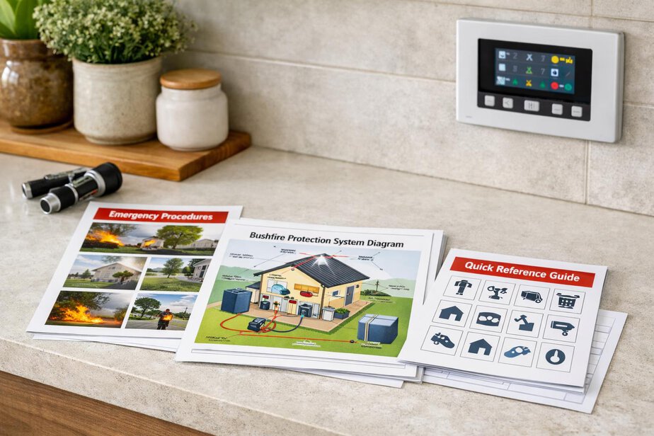
Printed documentation remains important because phones, internet services and even power can fail. For that reason, every system should include a printed A4 documentation pack as standard. This is not old-fashioned. It is a practical backup that helps residents, technicians and responders when digital access is limited.
The pack should include:
- Quick setup guide
- Homeowner guide
- Emergency operation guide
- Troubleshooting guide
- Technical guide
- Testing and maintenance schedule
- System diagram
- Firefighter information
- Service/contact details
- Commissioning and maintenance record
- One-page emergency quick-reference sheet
The quick-reference sheet deserves special attention. It should be kept near the main controls and written for fast use. It should show the most important actions in plain language, with enough detail to be useful but not so much that it becomes hard to read.
The homeowner guide should explain the normal screens, the status colours, the Fire Protection ON button, the controlled OFF / Reset process and where to find additional help. The emergency operation guide should explain what changes when the system enters Alert or Fire Mode. The troubleshooting guide should help the resident recognise common issues without pretending to replace professional service.
The technical guide can include the information technicians need to verify configuration, fault handling and scheduled maintenance. The system diagram should show the major components in a way that is useful to both residents and responders. Firefighter information should be concise and practical, helping authorised responders understand access and system behaviour without exposing unnecessary complexity.
Printed documentation should remain with the property. That makes handover easier when ownership changes and provides a reliable fallback when digital records are unavailable.
| Document | Main purpose | Who uses it most |
|---|---|---|
| Quick setup guide | Start-up and first use | Homeowner |
| Emergency quick-reference sheet | Fast action during stress | Everyone |
| Technical guide | Configuration and servicing | Technician |
| System diagram | Understanding layout | Homeowner and responder |
Make training mode safe and easy to recognise
Residents should be able to practise with the system before fire season. A simple demo or training mode can make a big difference because it lets people learn the screens, the buttons and the emergency prompts without creating real water flow or activating pumps and sprinklers.
Training mode must never start pumps, sprinklers or other emergency equipment. That requirement is essential. A practice session should feel realistic from the point of view of the interface, but it must remain a safe simulation. Residents can then become familiar with the sequence of screens before they need it for real.
A good training mode should make it obvious that it is a simulation. It should use clear labels, maybe a distinct colour banner or similar cue, so nobody mistakes practice for a real event. Residents should be able to practise these common actions:
- Checking Green, Amber and Red status
- Finding the Emergency Help screen
- Reviewing the “What do I need to do now?” screen
- Understanding Home, Away and Evacuating instructions
- Viewing the printed document references
The point is not to teach residents how the technical system works. The point is to teach them how to respond calmly and correctly. Simple repetition in a safe mode can reduce panic later.
A wise approach is to recommend that the household runs a short practice session when the system is first handed over and again before bushfire season. That builds confidence and helps people remember where to find the key controls when they are under stress.
Support standard property handover and annual review
Property handover should be built into the system from the start. Technical configuration should stay with the property, not the individual resident, so that a new owner or tenant can be guided through user setup without needing to rebuild the system from scratch.
The handover process should be standard and predictable. It should explain what belongs to the property, what needs to be reviewed, and what the new occupant should confirm before relying on the system. Where helpful, technician-assisted handover should be available as an option. That can be useful for larger homes, more complex installations or situations where the occupant wants extra reassurance.
A good handover process should cover:
- Basic system orientation
- How to read the main screen
- How to use Fire Protection ON
- How the controlled OFF / Reset works
- Where the printed documentation pack is kept
- How to update household and contact details
The system should also encourage a guided annual homeowner review. That review can confirm emergency contacts, occupancy settings, alerts, household profile details and the testing schedule. The point is to keep the system aligned with the real household, not to let information drift out of date.
This is especially important because residential life changes. A child may now be old enough to help with simple actions. An older resident may need extra time. Pets may be added. A trusted contact may change phone number. The system should make these updates straightforward rather than hidden in advanced menus.
The handover and review process should also remind residents that the system is only one part of the household plan. They still need to follow official warnings, prepare a bushfire plan and understand what to do if evacuation is advised or required.
Design for accessibility, clarity and low stress
Accessibility is not an extra feature. It is part of making the system safe for ordinary people. Large text, simple icons, high contrast and uncluttered screens should be standard. If the display is hard to read, the system is less effective when it matters most.
Menus should be shallow. Labels should be unambiguous. The main screen should not be crowded with minor status items that distract from the most important action. Residents do not need to see every possible subsystem detail on the first screen. They need the current status and the next step.
Good accessibility also means reducing the need for fine motor control. Buttons should be obvious and easy to press. Critical functions should not sit close together in a way that invites accidental touches. If a confirmation is needed, it should be clear and deliberate.
Another part of low-stress design is predictable structure. If the main screen always shows Green, Amber or Red first, then the user learns where to look. If the Emergency Help button always stays in the same place, the user can find it under pressure. If the “What do I need to do now?” screen always follows the same pattern, people can rely on it.
That predictability is not a cosmetic choice. It is a safety decision. When people are frightened, they do better with familiar layouts and short wording than with clever interfaces.
Complex protection behind the scenes. Simple, clear actions for the people living in the house.
That principle should guide every homeowner-facing screen in the system.
What the resident should never have to do in an emergency
- Choose between technical protection zones
- Interpret pump or hydraulic logic
- Search through multiple menus
- Guess whether a warning is serious
- Decide whether the system should start protecting the home
Those tasks belong to the system design and commissioning process, not the stressed homeowner.
Keep the system automatic, but never remove responsibility
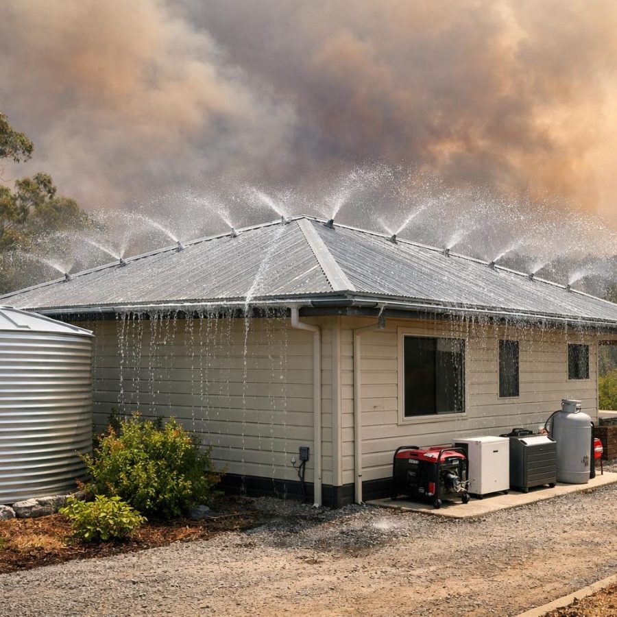
The system should remain automatic even if the resident does nothing. That is important because people may be asleep, away, injured, distracted or simply unable to act quickly. Automatic operation is part of the value of a residential bushfire protection system.
At the same time, simplicity must never remove necessary safety interlocks. The resident interface can be easy to use while the underlying system still protects against misuse, accidental shutdown and unsafe reset. Those safeguards are essential.
It is also important to be honest about what the system can and cannot do. A simple interface does not guarantee safety on its own. Residents still need an emergency plan, awareness of local conditions and compliance with official warnings and evacuation advice. The system helps the household respond better, but it does not replace preparation or judgment.
That balance matters in communication too. The homeowner should be told clearly that:
- the system can support protection,
- the family still needs a bushfire plan,
- official warnings must always be followed, and
- local procedures can change.
The best result is a system that is powerful behind the scenes and simple in the hands of ordinary people. That gives residents a better chance to act quickly, avoid confusion and use the protection they have paid for.
Conclusion: make the system easy to trust and easy to use
Part 17 is about turning a technically complex bushfire protection system into something ordinary people can actually use under pressure. The design should favour clear colours, plain-English messages, a single Fire Protection ON button, a safe OFF / Reset process, an accessible Emergency Help screen and a short “What do I need to do now?” guide for Alert and Fire Mode.
Guided setup, household profiles, optional trusted-contact alerts, training mode, printed A4 documentation and a structured handover process all help make the system practical in the real world. Just as importantly, they help residents build confidence before they ever need the system in an emergency.
The goal is not to simplify safety by cutting corners. The goal is to keep the protection strong while making the human side easy to understand. That is what ordinary homeowners need: calm information, sensible defaults and fewer chances to make a mistake when stress is high.
Before publication or implementation, verify the facts, confirm local procedures and check the latest requirements for the property, the installation context and the relevant authority guidance.
FireRescue Training Hub
Access practical fire and emergency study support resources, downloads, checklists, audio guides, and member-only course content.
- Course library
- PDF downloads
- Audio guides
- Checklists
Study support only. Not accredited training or a replacement for workplace procedures.
About the author and safety review
Ken Walker
Former Station Officer and fire service educator
Former career firefighter with extensive career and volunteer fire service experience.
Qualifications: Associate Diploma of Applied Science in Fire Technology; Institute of Fire Engineers studies.
Author profilehttps://www.firerescue.com.au/about-us/